 TruePx
 Docs / On the page
Measure & layout
Read any element’s size, padding and margin by hovering it, measure the gap between two elements, and check alignment with rulers, a column grid, breakpoint lines and X-Ray outlines.
Hover to measure#
With TruePx on (Inspect mode), move the pointer over the page. The element under it gets:
- A label with its tag and classes and its size in CSS pixels, for example
div.card 379 × 204. For an image the label also names its file format (JPG, PNG, WebP, AVIF, SVG…). - Its content box tinted blue.
- Its padding tinted green, with the size of each side written in it.
- Its margin tinted orange, with each side’s size.
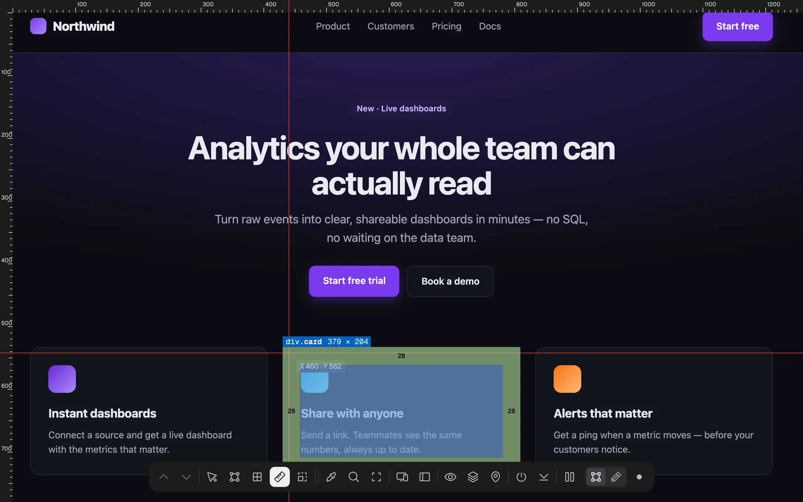
Sizes are what the browser actually laid out, so they include the effect of the page’s CSS at the current window width. Sub-pixel sizes are rounded in the label; the Element tab shows them to one decimal.
Measure the distance between two elements#
- Click the first element. It’s now selected: its label turns red and dashed guide lines run from its edges across the page.
- Hover the second element. Blue numbers show the gap between the two, in pixels, on each side where they’re apart.
- Click the first element again (or press Esc) to release it.

To select the element around the one you clicked, use Select Parent on the dock or Alt Shift ↑. Select Child (Alt Shift ↓) steps back down the same way.
Rulers#
Dock: Rulers · Key: 4
Adds pixel rulers along the top and left edges of the window, with a small tick every 10 px, a longer one every 50 px and a number every 100 px. Thin lines cross at the pointer, and a label next to it shows its position (X and Y from the top-left corner of the window). Use them to check that edges line up across sections, or to read a position without selecting anything.
Press 4 again to hide them.
Grid overlay#
Dock: Grid overlay · Key: 3
Lays a column grid over the page, the kind designers use in Figma, so you can check that content sits on the columns. The dock button opens the grid settings; the 3 key shows or hides the grid itself (so does the eye icon in the settings).
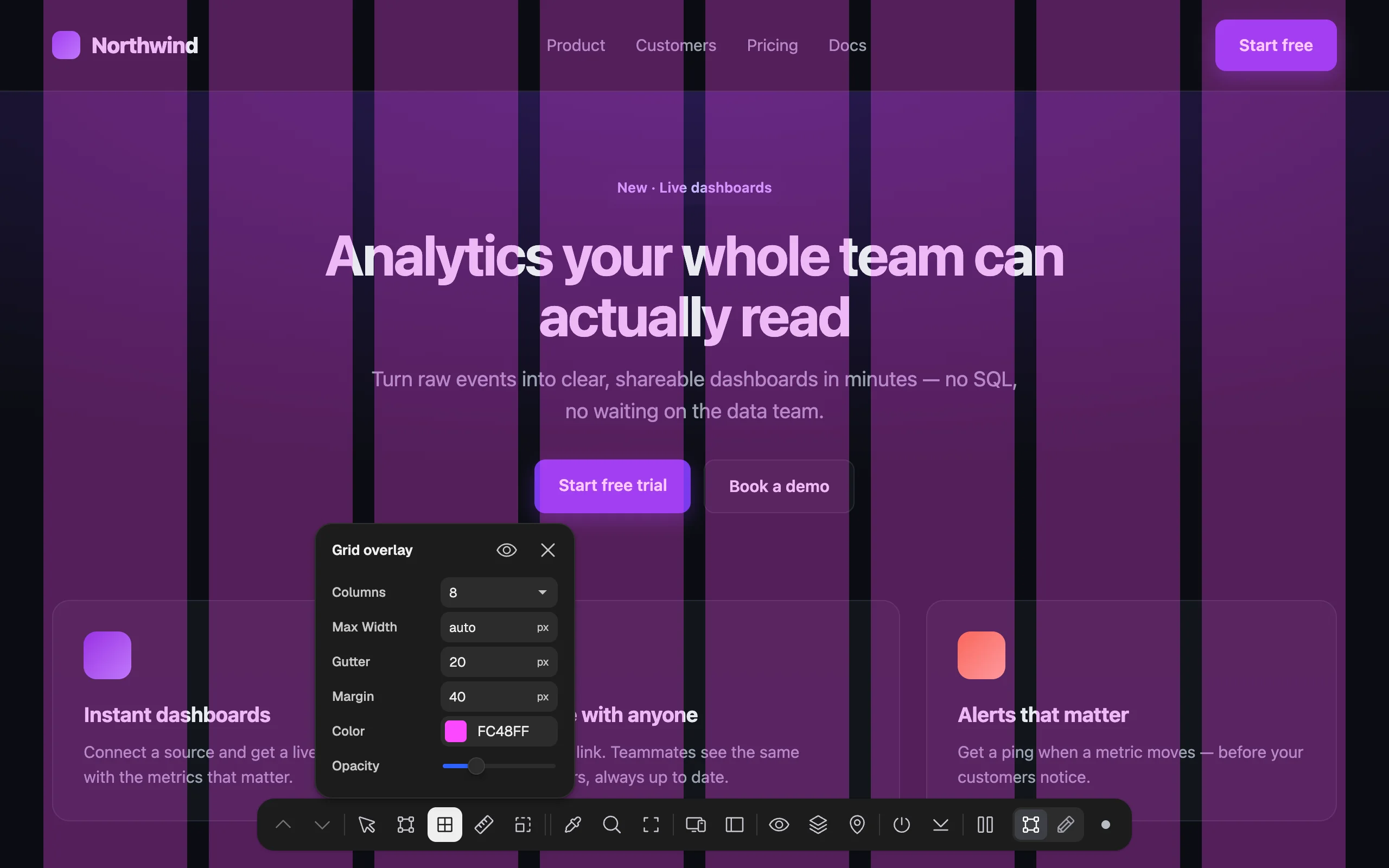
| Setting | Default | What it does |
|---|---|---|
| Columns | 8 | Number of columns: 2, 3, 4, 6, 8, 12, 16 or 24. |
| Max Width | auto | Caps the grid’s width and centers it, like a page container. auto fills the window minus the margins. |
| Gutter | 20 px | Space between columns. |
| Margin | 40 px | Space between the grid and each side of the window. |
| Color | #FC48FF | Column color. Type a HEX value or use the swatch. |
| Opacity | 30% | How see-through the columns are. |
Your settings are remembered for every site. Close the settings with the ✕ or Esc; the grid stays until you press 3.
Breakpoints#
Dock: Breakpoints · Key: 5
Draws a vertical line at every screen width the page’s CSS reacts to (its @media widths), labelled with the direction of the query: ≤900px for a max-width query, ≥1440px for a min-width one. It tells you, at a glance, where the layout changes, so you know which window widths to test. Lines past the right edge of the window aren’t visible; the responsive preview shows wider sizes.

X-Ray#
Dock: X-Ray · Key: 2
Outlines every element on the page at once, with a different color for each level of nesting (11 colors, then they repeat). Use it to see how a layout is built: which boxes wrap which, where an element is wider than it looks, or where stray empty elements push things around.
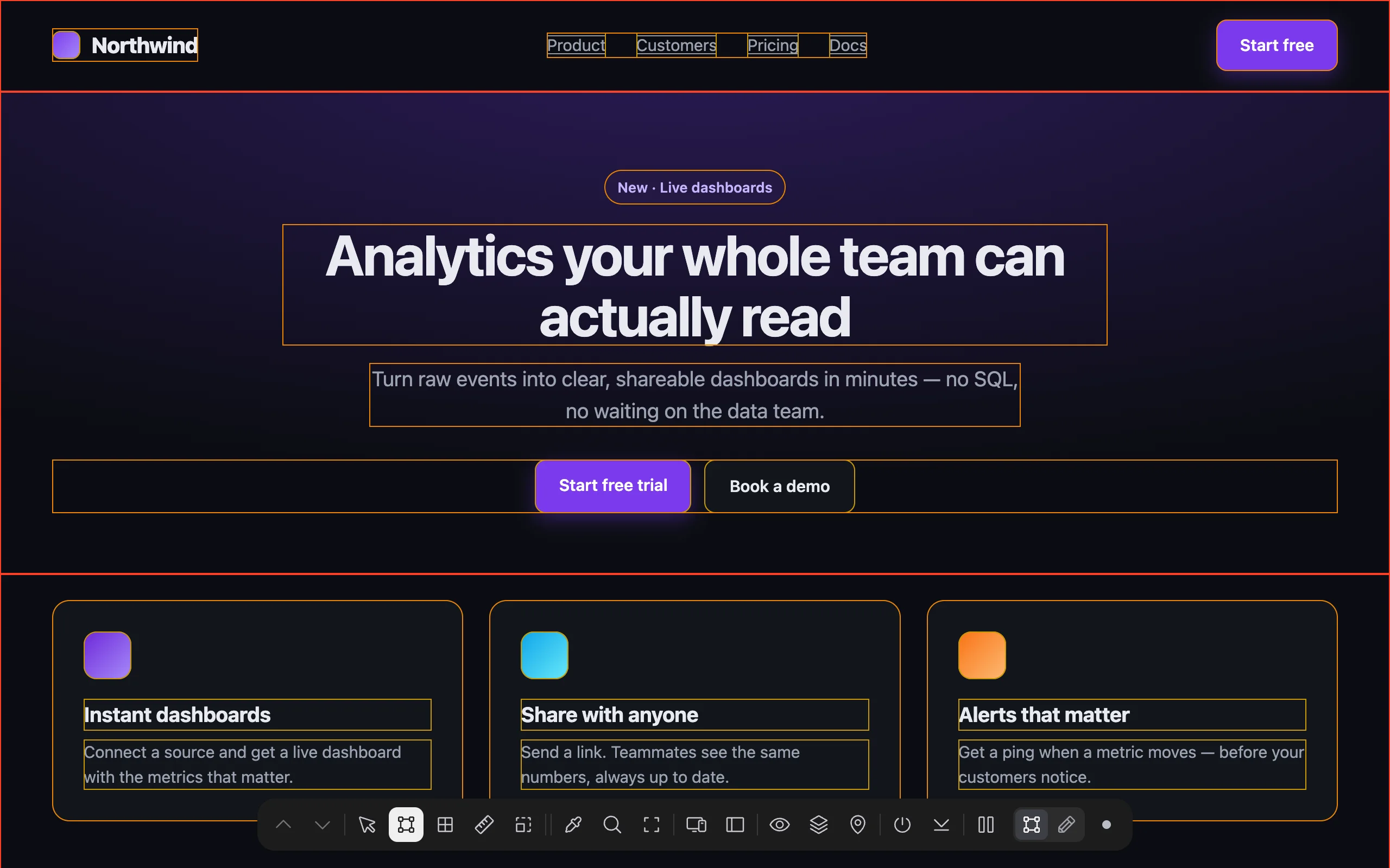
The outlines are drawn inside each element, so they don’t move the layout.
Tips#
- Measuring something that only shows on hover (a dropdown, a tooltip)? Pause with P, open it, then resume and measure. Or force the state from the Element tab.
- For several screen widths at once, open the responsive preview; Rulers, Grid, Breakpoints, X-Ray and the Inspector work inside each viewport there.
- For a full list of spacing values that are almost-but-not-quite consistent, run Design consistency in the Audit tab.