 TruePx
 Docs / On the page
Responsive preview
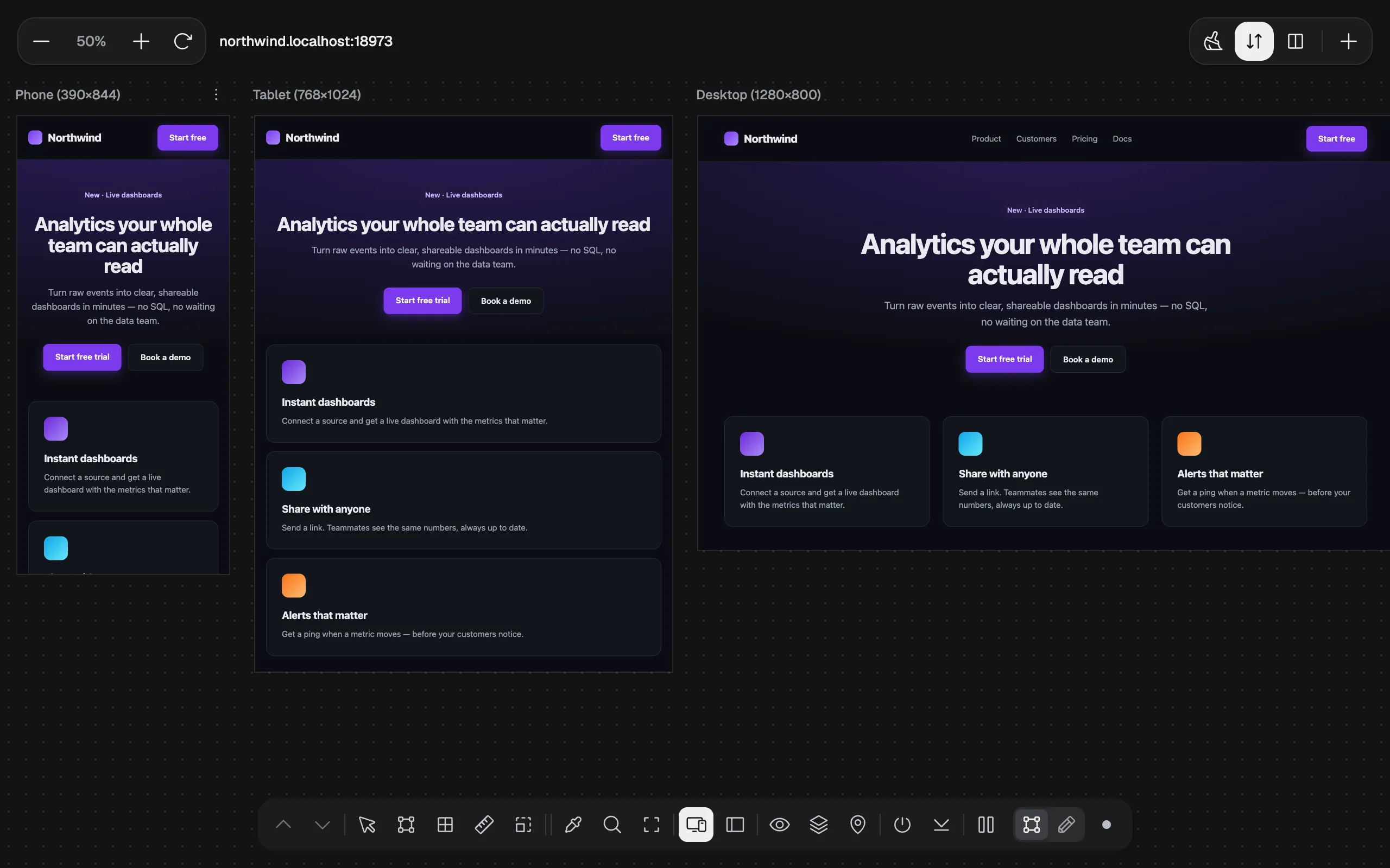
See the page at phone, tablet and desktop sizes side by side, each a real, scrollable copy of the page, and keep measuring, inspecting and editing inside every one of them.
Open the preview#
Dock: Responsive preview · Key: 9
The page is replaced by a canvas with three viewports: Phone (390 × 844), Tablet (768 × 1024) and Desktop (1280 × 800), at 65% zoom. Each viewport loads the same address at its own width, so its media queries, layout and images behave as they would on that screen.
If TruePx doesn’t have all-sites access yet, Chrome asks for it when the preview opens. It lets the preview load pages that normally refuse to be shown inside another page (see pages that block framing). You can decline; most pages still load.
Click 9 or the dock button again to close the preview and return to the page.
The toolbar#
| Control | What it does |
|---|---|
| − / zoom / + | Zooms the whole canvas: 25, 50, 65, 75, 100, 125, 150 or 200%. Zoom only scales what you see: each viewport keeps its real width, so the page’s layout doesn’t change. |
| Refresh | Reloads every viewport. |
| Address | The page being previewed. |
| Restore default viewports | (Broom icon.) After a confirmation, goes back to Phone, Tablet and Desktop at 65%. |
| Scroll together | When on, scrolling one viewport scrolls the others to the same place, so you can compare a section at every size. |
| Arrange viewports | Switches between one row (scroll sideways) and wrapping the viewports onto several rows. |
| New viewport (+) | Adds a viewport from the device list, or a custom size. |
Your viewports, zoom, arrangement and Scroll together setting are remembered for next time.
Each viewport#
Above every viewport is its name and size, plus its own buttons (on a narrow viewport they fold into a ⋮ menu):
- Name: click it to switch this viewport to another device, or choose Custom… and type a width (200–3840 px) and height (300–3840 px).
- Move Left / Move Right: reorder the viewports.
- Rotate: swaps width and height (portrait ↔ landscape).
- Light / dark: forces this viewport into light or dark mode; click again to go back to the system setting. Use it to check a site’s dark theme without changing your computer’s.
- Refresh frame: reloads just this viewport.
- Delete viewport: removes it, after a confirmation.
You can also drag a viewport’s right edge, bottom edge or bottom-right corner to resize it freely.
If something on the page is wider than a viewport, a warning under it says ⚠ Content overflows horizontally: that screen gets a sideways scrollbar. The Audit tab can name the element responsible.
Device sizes#
The device list has 23 sizes in three groups:
| Group | Devices (width × height in CSS pixels) |
|---|---|
| Phones | iPhone 17 Pro 402 × 874 · iPhone 17 Pro Max 440 × 956 · iPhone 16 393 × 852 · iPhone 16 Plus 430 × 932 · iPhone 12–15 390 × 844 · iPhone SE 375 × 667 · Galaxy S24/S25 360 × 780 · Galaxy S25 Ultra 412 × 883 · Pixel 9 412 × 915 · Pixel 9 Pro XL 448 × 997 · Android Compact 360 × 800 · Android Large 412 × 915 |
| Tablets | iPad mini 768 × 1024 · iPad Air 11″ 820 × 1180 · iPad Pro 11″ 834 × 1194 · iPad Pro 13″ 1024 × 1366 · Galaxy Tab S 800 × 1280 |
| Laptops & Desktops | 1366 × 768 · 1440 × 900 · 1536 × 864 · 1920 × 1080 · 2560 × 1440 · 4K 3840 × 2160 |
Tools inside the viewports#
While the preview is open, the dock drives every viewport at once:
- Hover and click inside any viewport to measure and select, exactly as on the page. The side panel follows your selection.
- Inspector, X-Ray, Grid, Rulers and Breakpoints show inside each viewport, at that viewport’s size.
- Find by selector searches every viewport.
- Pause (P) lets you click links and scroll inside the viewports.
- Edit mode works inside a viewport too. Edits you make there carry over to the page when you close the preview.
Pages that block framing#
Some sites tell browsers not to show them inside another page (with an X-Frame-Options or Content-Security-Policy: frame-ancestors header). With all-sites access, TruePx lifts that rule for this tab’s preview only, while the preview is open, so those sites load too.
Without that access, such a viewport can’t show the page. When TruePx detects this (after a few seconds), the viewport shows This page blocks framing (X-Frame-Options / CSP) with a button, Open at this size in a new tab. The button opens the page in a normal new tab; resize that window to the size you want to check.
Tips#
- Turn on Breakpoints (5) to see, in each viewport, which CSS widths are near.
- To check every width between the presets automatically, run Other screen widths in the Audit tab.
- An AI agent can open the same canvas, set its viewports and zoom, or open one viewport per breakpoint the page declares; see AI agents.